Gehry's Philosophical Approach

Gehry's architectural journey began while in university at USC. During this time, he found himself spending more of his time around the art students as opposed to his fellow architectural classmates. Longtime friend of Gehry, Charles Arnoldi, spoke in reference to Gehry's commonality with artists, "we see infinite possibilities  and Frank was hanging around people like us." He was inspired by this different language, and wasn't afraid to incorporate such inspiration into his work. Associates of his firm often say they're looking up painting he's referred to in design discussions. When director of the Los Angeles County Museum of Art would hear complaints that Gehry had taken an idea from them, "I would smile ans say that's part of his genius. He has the incredible ability to absorb all kinds of ideas." While attending the Harvard Graduate School of Design, Gehry had become infatuated with Le Corbusier's paintings, Gehry was impressed with how he developed his own language, his shapes were in his paintings and in his buildings, he was painting his ideas.

 Taureau III (Bull III) - Le Corbusier 1953
http://www.tate.org.uk/art/artworks/le-corbusier-bull-iii-n06224
While Gehry was still starting out in southern California, he became very familiar with Japanese Classicism, a look that was synonymous with southern California. It focused on features of wood and light, Gehry spoke to this preference, "it as the whole aesthetic that worked here and was accessible to a young architect because you could imagine doing it. That's the key, I think." In his youth, Gehry studied every aspect of Frank Lloyd Wright's work he could. Wright's approach was the Californian style that Gehry could access. This notion of wood and light can be seen in one of Gehry's first designs, Steeves house, is very similar to the aesthetic approach of Frank Lloyd Wright. And despite the fact that Gehry's design sense has evolved an immense amount over his life, he still incorporates his early philosophies into some of his more recent work. Shown below is an interior view of the Disney Concert Hall he designed in Los Angeles, which features the aspects of wood and light that he started out with.

Steeves House - Frank Gehry, Greg Walsh - 1960
http://anavedobomgosto.blogspot.ca/2010/07/steeves-residence.html
Walt Disney Concert Hall (Interior) - Frank Gehry - 2003
http://www.jimmchugh.com/projects/disneyhall/index.php


Gehry has long been intrigued by movement and inert materials. Which lends to his interest in fish, as a young boy he has memories of going to the marketplace with his grandparents and purchasing carp. Gehry was also influenced by Japanese woodcuts of the 19th century which featured carp drawings. Gehry was interested in the form of a fish, and the notion of bringing movement into his architecture, it was his way of exploring the technique of double curves. Gehry includes in an interview, "I would bet most architects avoid double curves, like I did, because we didn't have a language translation into buildings that was viable and economical, and I think the study of fish allowed me to create a kind of personal language, which I now know how to use. So it was a demystification of that stuff, and it was an enormously important study for me."

Port Olimpic, Barcelona Spain - Frank Gehry - 1992
http://www.flickr.com/photos/archimap/2541439475/sizes/o/in/gallery-dominicspics-72157623374579116/
Frank Gehry refers to his philosophical approach in the way of a "personal language". These three different approaches he takes to architecture all have one thing in common, they are relative to his surroundings. He is intrigued by art and paintings, because growing up his mother was artistic, and he chose to surround himself by other artists. His early career starting in California, Gehry designed with the use of wood and light, he studied his surroundings, and was able to produce designs that were of the vernacular of Southern California, which was familiar to him. The same goes with his interest in fish forms, it stemmed at an early age for Gehry and carried through into his design technique. It is fair to say that, Frank Gehry's approach to design comes down to a personal articulation of ideas which stem from individual experiences and influences.

Gehry's Work

* Images can be clicked on to view larger versions

Cleveland Clinic Lou Ruvo Center for Brain Health 
(2009, Las Vegas, Nevada - Frank Gehry)


Front View
http://buildipedia.com/in-studio/featured-architecture/cleveland-clinic-lou-ruvo-center-for-brain-health-by-frank-gehry
Detail
http://buildipedia.com/in-studio/featured-architecture/cleveland-clinic-lou-ruvo-center-for-brain-health-by-frank-gehry
Ruvo Model
http://buildipedia.com/in-studio/featured-architecture/cleveland-clinic-lou-ruvo-center-for-brain-health-by-frank-gehry
Ruvo Plan
http://buildipedia.com/in-studio/featured-architecture/cleveland-clinic-lou-ruvo-center-for-brain-health-by-frank-gehry
Ruvo Elevation
http://buildipedia.com/in-studio/featured-architecture/cleveland-clinic-lou-ruvo-center-for-brain-health-by-frank-gehry

______________________________________________________
______________________________________________________


Guggenheim Museum Bilbao 
(1997, Bilbao, Spain - Frank Gehry)


Photograph of Museum
http://whyevolutionistrue.wordpress.com/2012/02/04/botton-backs-off-the-atheist-temple/02-guggenheim-museum-bilbao-spain-1/
Interior View of Museum
http://adamhalliwell.wordpress.com/2010/11/04/bilbao-spain/
Photograph of Museum
http://www.caminoways.com/destinations/camino-de-santiago/northern-way---coastal-walk/camino-northern-way-section-1-5.html

Sketch of Guggenheim
http://www.maverickplanet.co.uk/index.php/2011/03/477/
Elevations of Guggenheim Museum
https://blogger.googleusercontent.com/img/b/R29vZ2xl/AVvXsEj7MNomRm-DNqcUfk7wmZgtFzq-KbkSmixi9QORxKs7E5GRIoUTC6imtahN8yg4BzCdCyW49QjGtzboR_7k0oOyBhZjtFrS2xSPcleFupEwbWjHz4N3tEworXwXETmjQ_dva5vI-ccfXt8/s1600/17.jpg


______________________________________________________
______________________________________________________


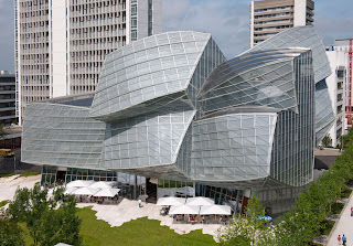
Novartis Pharma AG Campus
(2009, Basel, Switzerland - Frank Gehry)

Rendering of Campus
https://blogger.googleusercontent.com/img/b/R29vZ2xl/AVvXsEhM7sHjWWXhZYMjJjt64thQd5mPiuiAWuxlLYVVU24BQVe8f_HQNdGyRapvMTiWBwQ4c7h1oHOxi2uWwmk-JLLrKFGLcMqt-ElJRRhajy6hiqSJSrqwQZGQOemFrz4zeMp6HQkvhxogPQQ/s1600/0090817-6184.jpg
Exterior View
http://4.bp.blogspot.com/-v9Sz6ZaBNGs/UH5E5LfRVI/AAAAAAAAAFM/HschefYQtgI/s1600/6_novartis_campus.jpg

Aerial View
https://blogger.googleusercontent.com/img/b/R29vZ2xl/AVvXsEjTdfFIyeufslsnJUFyCI8IaOzCCs_8Y5PjSInj0wlu9SlcETmLOdrDL5tv3JfxO-24DSUr19EfiQV_mKz26j2fLB4dA0HDKcLavE7bdLoEBJQpBEJIvTdUtkIWO6FwtK8RhKJLehf3JBc/s1600/5650962.jpg

Section Drawing
https://blogger.googleusercontent.com/img/b/R29vZ2xl/AVvXsEhtzmT2yHuWaMNi41AfGH5ig8KtaQoaQ8iyLbW3nnpX8-raT70MCUwkuPEBXiP82R2WpLPEdfVfn3F6aqCt9Ej4Bd-XaX_-hEv-eaOiOYW3GBBn5zBV34t215bRAEnPMVf_-NOUgko5wi4/s1600/14_novartis_campus_drawings.jpg
Floor Plan
https://blogger.googleusercontent.com/img/b/R29vZ2xl/AVvXsEgb5DhzxmBURdl5YYm4etrUFD6TLdEFklM6UUtWHXbbgdEPVDFOJnC55gkcPNvKvSJMHEmx2pUoCOtV7zanAYeD5u0lbXCQvdbqUqPnrvuMA4f8qKob0GZUo75MuwbSAXlLJWYbt8wnkC8/s1600/13_novartis_campus_drawings.jpg


Comparison to Other Contemporary Designs

Heydar Aliyev Cultural Center - 2012 - Baku, Azerbaijan - Zaha Hadid
http://upload.wikimedia.org/wikipedia/commons/thumb/3/39/Heydar_Aliyev_Cultural_Center_2.jpg/1280px-Heydar_Aliyev_Cultural_Center_2.jpg

In comparison with ...


Fish Sculpture - 1992 - Barcelona, Spain - Frank Gehry
http://www.bluffton.edu/~sullivanm/spain/barcelona/gehry/fish.html
In these two pieces of architecture, Hadid and Gehry employ very similar curvature to their design. Gehry is known for designing fish inspired work, like shown here, that may not have been Hadid's philosophical approach, yet from that perspective these buildings or sculptures are very alike.


      ___________________________________________________
        ___________________________________________________


Art Gallery of Alberta - 2010 - Edmonton, Alberta - Randall Stout Architects
http://www.samanthadasilva.com/uploads/1/4/1/0/1410639/4378641_orig.jpg

In comparison with ...

Walt Disney Concert Hall - 2003 - Los Angeles California - Frank Gehry
https://blogger.googleusercontent.com/img/b/R29vZ2xl/AVvXsEh0uvtj8hiBRNU9cYUYvnzyGWMnaiNFQbE8wVDP5sY-rFj4KmWBeE0jiLOtpQ-5PJU26XHoU6xVRS0Qt271jOlAfMLon5oas6MjEo9N86IhVQu8TB-p2_OeLZnURHHIMUjSWjmuQZvRmQg/s1600/800px-Disney_Concert_Hall..JPG
It is not much of a surprise to see such an alike design aesthetic achieved by Stout to Gehry, as they were colleagues in the past. Stout employs curvature and a whimsical sense through the use of corrugate metal steel - much like several of Gehry's designs. Gehry approached the Walt Disney Concert Hall with the idea of creating forms and sails. Stout's concept was to incrorporate Edmonton's North Saskatchewan River against the stiff grid of the city. Both metaphorical ideas were achieved in these designs.

      ___________________________________________________
        ___________________________________________________


Steinhaus - 1980 - Steindorf, Austria - Gunther Domenig.
http://en.wikipedia.org/wiki/File:Domenig_guenther_steindorf_ossiacher_see_14.jpg
In comparison with ...

Schnabel House - 1989 - Brentwood, California - Frank Gehry
http://www.latimes.com/features/home/la-hm-schnabel-house-photos,0,767364.photogallery

Both Domenig, and Gehry approached these designs in an unconventional way, a way some would refer to as deconstructivism. In other words, it is a distortion or fragmentation of parts and elements of the design. This style began to arise more in the 1980's, so a sense of experimentation can be felt by these structures.

Historical Influences

Frederick Weisman Museum - 1993 - Minneapolois, Minnesota - Frank Gehry
http://www.britannica.com/EBchecked/media/118436/The-Frederick-R-Weisman-Art-Museum-University-of-Minnesota-Minneapolis

Tibetan Monastery - Architect Unknown
http://photopostcards.blogspot.ca/2008/01/tibetan-monastery.html

When Gehry was coming up with a concept for the Weisman Museum, he claimed to have gained his inspiration from how Tibetan Monastery's appear atop of hillsides. The similarities can be seen through the achievement of differing heights. This Monastery stands out against it's background, and that is something Gehry strives to achieve with many of his designs. Especially with his use of metal, when the sun reflects upon it, it gives the building it's own presence opposing it from the other surroundings, drawing attention to itself.

_________________________________________________________
_________________________________________________________


8 Spruce Street - 2010 - New York, New York - Frank Gehry


Ecstasy of Saint Teresa - 1652 - Santa Maria Della Vittoria, Rome - Bernini 

Gehry references historical sculptures and architects such as Michelangelo and Bernini when it comes to his design approach. Michelangelo carves until he finds the answer, much like Gehry sketches until he finds his answer. Gehry particularly finds inspiration in the sculpture of Saint Teresa because of his fascination with folds. Bernini creates a billowing facade of folds within the drapery worn by Saint Teresa, Gehry is able to modernly mimic this technique within his design for 8 Spruce Street building.